Paulo
Brand Guidelines
These guidelines describe the visual and verbal elements that represent Paulo's corporate identity. This includes our name, logo and other elements such as color, type and graphics.
A consistent and controlled message of who we are is essential to presenting a strong, unified image of our company.
These guidelines reflect Paulo's commitment to quality, consistency and style. The Paulo brand, including the logo, name, colors and identifying elements, are valuable company assets.
Brandmark Anatomy

-
Full Logo This is the primary way the logo should appear.
-
Full Tagline This is the statement that Paulo represents and embraces.
-
Logo Mark The mark can appear in isolation for certain purposes but the Logo text should never appear without the mark.
Secondary Logos
The secondary, or horizontal logo, can be used when the space requires the ball to be added.
Download All Secondary LogosVariations of Logos
The "ball" Mark is an abridged version of the Paulo logo. While it shouldn't be used in place of the full logo, it is best used as a design accent or motif.
Download All VariationsUsing The Brandmark with Photography
When placing a logo on top of a photograph or background of any sort, strong contrast must be ensured. For darker images, use the white version of the logo. For lighter images or areas on an image, use either the full color or black version.Logo Applications
The following is how the Paulo logo should be used when on a light or dark background.
Logo on Light Background
Logo on Dark Background
Improper Usage
The following are examples of how NOT to use or treat the logo variations that have been provided. These rules are in place to ensure brand consistency and aesthetic strength.
Disproportionate scaling, squishing, or stretching.
Drop shadows
Unauthorized tilting
Unauthorized outlining
Changing the logo colors
Unauthorized removal of tagline
Primary Color System
These are the approved brand colors
Secondary Color System
These are the approved secondary brand colors
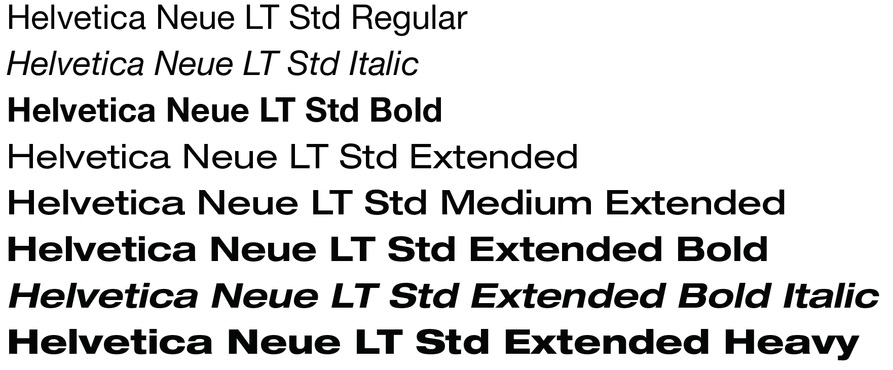
Helvetica Neue LT Std
HEADERS, SUB-HEADERS & BODY
The Helvetica Neue LT Std typeface is the primary font family for Paulo.

Can’t find something? Have a question?
Let us know how we can help. Feel free to give our branding expert a call or send them an email anytime. Their information is below. We will get back to you within one business day.